January 2, 2026
How to Create a Hero Section That Converts 90% of Your Visitors

High-converting hero sections serve as powerful gateways that communicate value before a visitor scrolls or explores deeper content. Strong clarity helps remove hesitation by showing exactly how your product or service solves a pressing need within seconds.
Bold headlines catch attention quickly and give structure to the message that follows, guiding users toward the desired action. Modern audiences rely on immediate visual cues, expecting brands to present benefits clearly without unnecessary noise.
Fast comprehension builds trust because users appreciate websites that respect their time and communicate confidently. Persuasive visuals reinforce the message, creating emotional alignment between the problem and the promised outcome.
Strategic CTAs focus attention and push visitors toward a specific step that drives conversions, not confusion. Design choices play a major role in how quickly users understand the message and how engaged they remain.
Effective hero layouts often eliminate clutter, allowing primary value statements and actions to stand out dramatically. Building a hero section that converts requires thoughtful messaging, strong hierarchy, intentional imagery, and friction-free pathways.
"Boost your conversion potential today.
Book a strategic design session to improve clarity."
Table of Contents
- The Problem With Most Hero Sections
- The 6 Elements of a High-Converting Hero Section
- Real-World Examples That Work
- How to Apply This to Your Website?
1. The Problem With Most Hero Sections

Most websites fail at the hero section. Either they welcome users with bland text like “Welcome to our website,” or they overload it with too much noise. No clear value. No action. No trust signals. And without those, visitors feel lost or uninterested.
That’s why conversion rates stay low. Your hero section isn’t pulling its weight, but that’s about to change.
2. The 6 Elements of a High-Converting Hero Section

1. Clear, Compelling Headline
Your headline is the hook. It should speak directly to your audience’s pain points or desires. Avoid vague or generic intros. Try a direct benefit-driven headline like:
“Double Your Sales in 30 Days.”
2. Strong Visuals That Make an Impact
Whether it's a high-quality image, background video, or animated visual, the goal is to show what your brand delivers. Make that first impression count with visuals that reflect your product or team’s energy.
3. A Clear Value Proposition
Why should they care? What’s in it for them? Answer that fast. A strong value statement like:
“Our platform helps you generate leads and increase revenue—fast!”
…makes people want to learn more.
4. An Obvious Call-to-Action (CTA)
Don’t be subtle. Make your CTA button bold, direct, and easy to find. Use phrases like:
“Get Started Free,” “Download the Guide,” or “Claim Your Offer.”
5. Social Proof Builds Trust
Show reviews, testimonials, or logos of companies you’ve worked with. Example:
"This system doubled our sales in just weeks!" — John S., CEO of XYZ Company.
Trust is everything when someone is deciding whether to take action.
6. Eliminate Distractions
Keep the hero section focused. Don’t cram in unnecessary links or widgets. Guide the eye toward your CTA and core message — and leave everything else below the fold.
3. Real-World Examples That Work
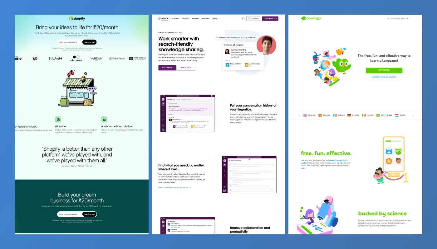
Let’s look at how top companies build hero sections that convert:
Shopify
They hit you with a straight-to-the-point headline. It’s clean, fast, and shows value in seconds. Right next to it? A bold Start Free Trial button. No clutter. No friction.
Slack
Their hero section offers a free version. They show logos of big brands that use their product. A short demo video explains how it works. Once people start using Slack for free, they often upgrade — no pressure, just great UX.
Duolingo
Their headline reads:
“The free, fun, and effective way to learn a language.”
It’s catchy, benefit-driven, and supported by playful visuals. The Get Started button is prominent and irresistible.
These examples prove that with the right mix of clarity, design, and persuasion, your hero section can become your most powerful conversion tool.
4. How to Apply This to Your Website?

Here’s your action plan:
- Rewrite your headline to make it benefit-driven and bold.
- Add a high-resolution image or short demo video.
- State your unique value in one sentence.
- Place a high-contrast CTA button where users naturally look.
- Display one strong testimonial or a few logos of trusted clients.
- Remove anything that distracts from the main goal — conversion.
Test different versions, track your results, and refine based on real data.
Conclusion
Powerful hero sections consistently outperform generic layouts because they communicate value with precision and emotional clarity. Focused messaging helps users understand the core benefit instantly, creating confidence and reducing hesitation.
Strong visuals amplify impact by connecting meaning, context, and brand identity in a single visual frame. Strategically placed CTAs ensure visitors know exactly what action to take without scanning for direction.
Simplified layouts guide the eye effortlessly, keeping the hero section clean, readable, and highly persuasive. Better hierarchy strengthens comprehension by highlighting the elements that push conversions forward naturally.
Testing and refinement ensure the hero remains aligned with user behavior, market trends, and analytics insights. Well-designed hero sections ultimately turn fleeting first impressions into measurable business growth.

FAQ
1. What makes a hero section convert effectively?
Clear messaging, strong visuals, and a focused CTA create immediate clarity and encourage fast action.
2. How long should hero text be for best conversions?
Short, sharp, and benefit-driven lines perform best because they remove friction and simplify decision-making.
3. Where should the CTA be placed in a hero layout?
Placement near the headline or value statement ensures users see it instantly without searching.
4. Why does hero imagery matter so much?
Images shape emotional tone, demonstrate context, and reinforce the promise being communicated.
5. Who should update a hero section for better performance?
Designers and strategists experienced in UX and conversion psychology deliver the most effective improvements.
6. How often should hero sections be tested or updated?
Frequent refinement keeps performance high as user behavior, trends, and business goals evolve.
Table of Contents
Choose Our Service, Grow Fast!
Follow Us
Related Posts
May 12, 2026
Hostinger Review 2026: Find pros, cons & a valid 20% OFF coupon! Get a discount on web hosting or VPS hosting. Exclusive coupon code inside!
Hostinger Review 2026: Find pros, cons & a valid 20% OFF coupon! Get a discount on web hosting or VPS hosting. Exclusive coupon code inside!

Want to create a Webflow website? We review the leading Webflow design and development agencies that can help you achieve great results.
Want to create a Webflow website? We review the leading Webflow design and development agencies that can help you achieve great results.

.webp)
Hiring a Webflow agency? Learn how to choose the right partner, compare agency vs freelancer, understand pricing, and avoid costly mistakes in this complete 2026 guide for SaaS & B2B teams.
Hiring a Webflow agency? Learn how to choose the right partner, compare agency vs freelancer, understand pricing, and avoid costly mistakes in this complete 2026 guide for SaaS & B2B teams.

Ready to Scale Your Project to the Next Level?
Let's take your project to new heights, reach out and see how we can help you.
