
If you’re building a SaaS app, your pricing page is far more than just a place to display numbers. It’s the final decision-making checkpoint for your users. This is where your potential customers decide if your solution is worth their investment and trust.
Here’s the truth: a confusing, cluttered pricing page can destroy your conversions, no matter how great your product is.
You might have spent months building an amazing SaaS tool, but if your pricing page makes users hesitate, they’ll simply leave and possibly choose a competitor whose pricing page felt clearer and easier to understand.
In this blog, you’ll learn exactly how to plan and design a high-converting pricing page for your SaaS app.
We’ll cover actionable layout strategies, design psychology, and proven elements that guide visitors confidently towards choosing the right plan for them – without second-guessing or abandoning your site.
"Drive more signups with a pricing page that converts intelligently.
Book a free strategy call - we’ll help optimize your SaaS pricing layout."
Table of Contents
- Keep the Pricing Layout Simple and Clear
- Use a Monthly & Yearly Toggle
- If Pricing Is Usage-Based, Show It Visually
- Highlight One Plan as Most Popular or Best Value
- Add a Feature Table – Side by Side
- Add a Competitor Comparison Table
- Add a Trial or Guarantee
- Add Real Testimonials Near Pricing
- CTA Buttons that Feel Natural
- Don’t Forget an FAQ Section
- Make It Mobile-Friendly
- Support, Security, and Custom Options
- Quick Checklist Recap
1. Keep the Pricing Layout Simple and Clear
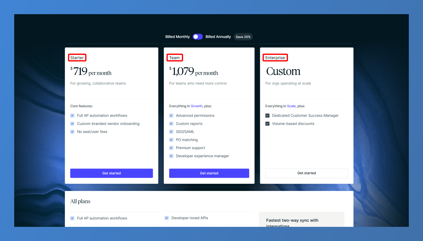
The golden rule of SaaS pricing pages is clarity over creativity. Start with the basics: display all your plans side by side so users can easily compare them without scrolling endlessly.
Each plan should have:
- A clear title: Starter, Team, Business, or Enterprise work better than creative but confusing names.
- A concise description of who the plan is for. For example, “Ideal for freelancers starting out,” or “Built for growing startups and small teams.”
Avoid generic or brand-heavy titles without context. Remember – users skim before they read. Your layout must communicate instantly.
2. Use a Monthly & Yearly Toggle
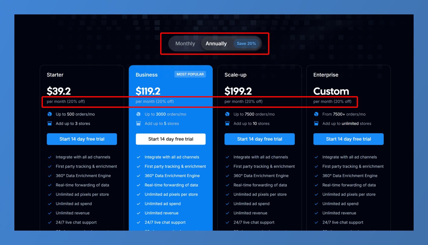
Most SaaS apps offer both monthly and yearly billing. Adding a simple toggle switch allows users to choose how they want to pay and compare the two options without confusion.
If you offer a discount for annual billing (which you should), highlight it clearly. Use statements like
- “Save 20% with annual billing.”
- “2 Months Free – Billed Annually.”
Under the price, always indicate the billing frequency to avoid surprises at checkout. Transparency builds trust and reduces drop-offs during signup.
3. If Pricing Is Usage-Based, Show It Visually
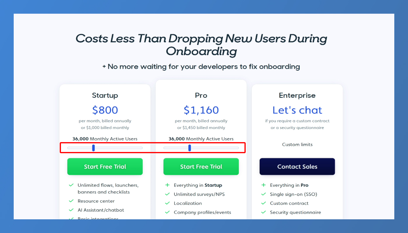
If your SaaS pricing depends on usage metrics (such as number of users, storage, emails sent, or API calls), use an interactive slider.
Why?
- It makes the pricing feel dynamic and flexible.
- Users can visualise what their cost will be based on their exact needs.
- It reduces cognitive load by allowing them to explore options without reading fine print tables.
When users slide between options and see the price update instantly, it creates a sense of control and clarity, increasing the chances of conversion.
Want to find hidden revenue leaks on your SaaS website?
Get our free 47-point SaaS Website Audit Checklist → Download now
4. Highlight One Plan as Most Popular or Best Value
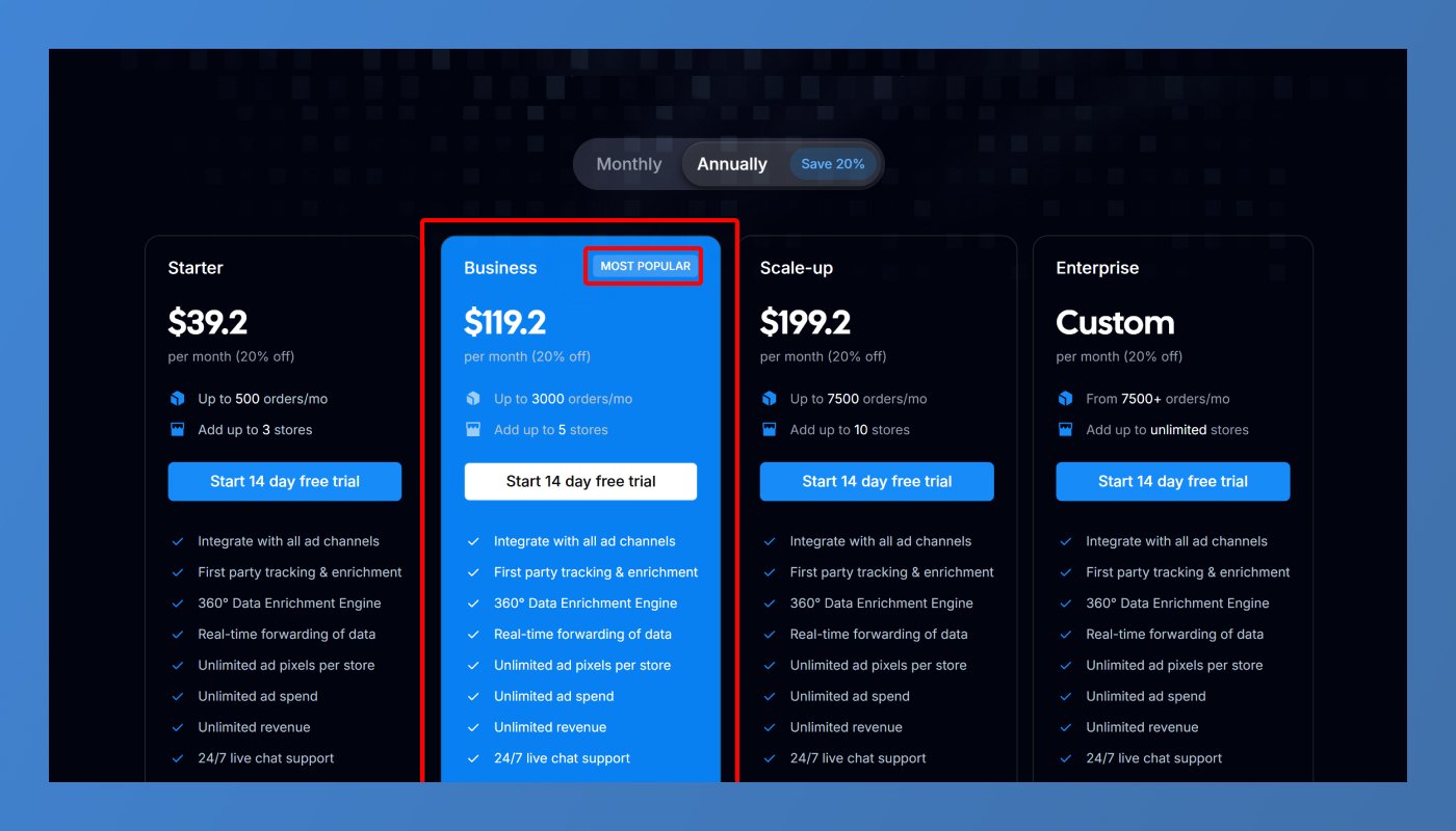
Most visitors will gravitate towards the middle plan, but your design should strategically guide them.
Highlight a recommended plan by:
- Adding a badge like “Most Popular”, “Best Value”, or “Recommended for Teams.”
- Using a contrasting background color or a subtle glow effect to make it stand out.
- Increasing its card size slightly to draw visual attention.
This gentle push makes decision-making easier for users and often increases your Average Revenue Per User (ARPU).
5. Add a Feature Table – Side by Side
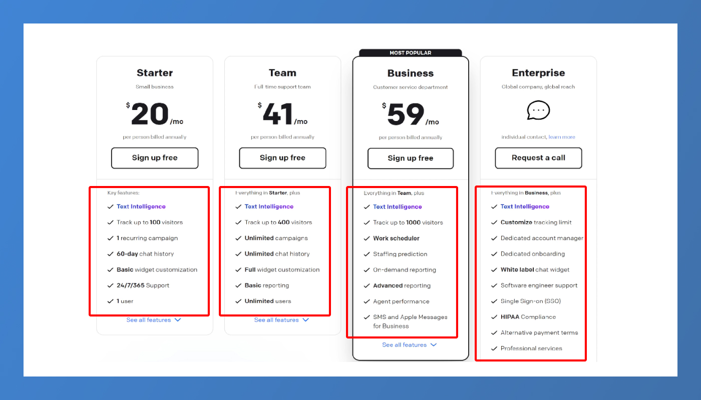
Below your pricing plans, include a feature comparison table. This is essential because:
- Users want to know what exactly is included in each plan.
- It avoids them feeling like they’re missing out or being forced to guess.
Keep it clean and visual:
- Use checkmarks for included features and dashes for unavailable ones.
- For complex features, add tooltips explaining what they are in simple terms.
Clear comparison tables build confidence and reduce buyer hesitation.
6. Add a Competitor Comparison Table
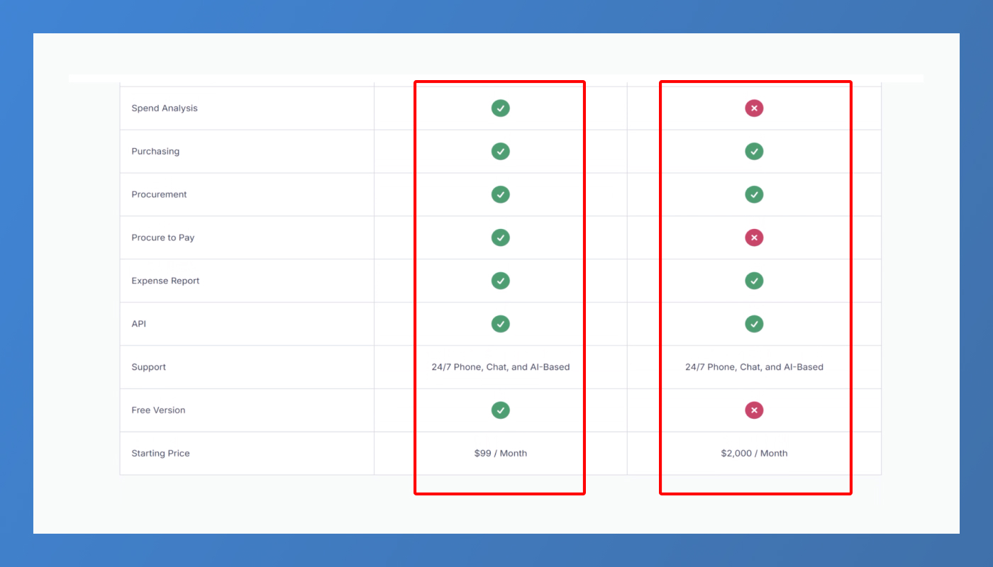
Even if you don’t mention competitors, users are comparing you with them. Help them by adding a competitor comparison table that:
- Shows your key differentiators (speed, support, features, and compliance).
- Uses a neutral and factual tone (avoid negative or aggressive comparisons).
This builds authority and subtly reinforces why your SaaS solution is the right choice.
7. Add a Trial or Guarantee
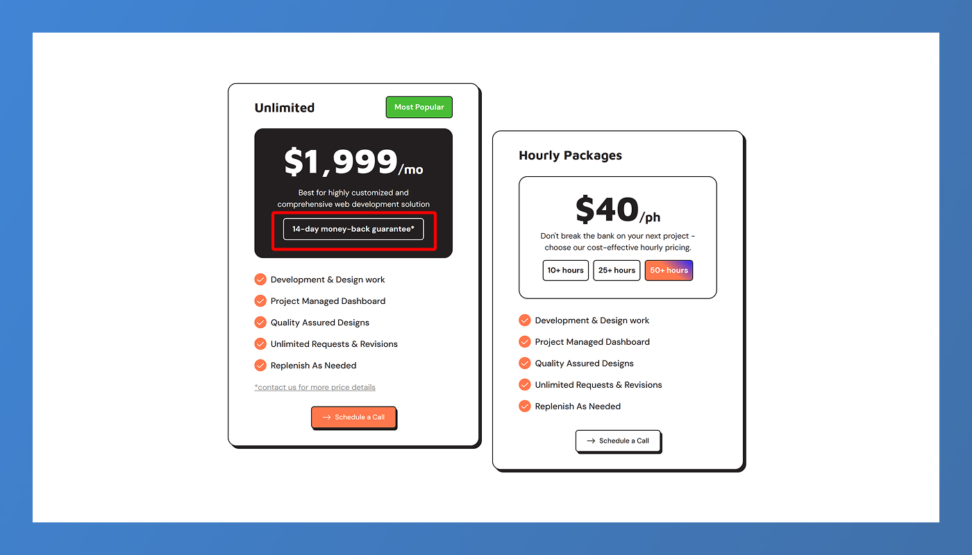
If you offer a free trial or money-back guarantee, make it prominent. For example:
- “Start your 14-day free trial – no credit card required.”
- “30-day money-back guarantee.”
These remove risk and reduce objections, especially for first-time buyers unfamiliar with your brand.
8. Add Real Testimonials Near Pricing
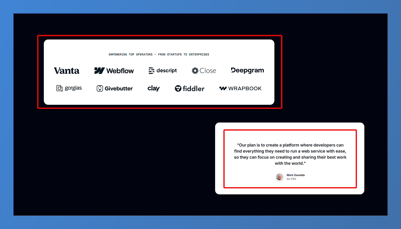
Placing testimonials close to your pricing leverages social proof at the moment users are making decisions.
Include:
- A short quote (1-2 sentences).
- The user’s name, role, and company (logo if B2B).
- A photo for authenticity.
Even 2 or 3 strong testimonials can significantly increase conversions by building trust where it matters most.
9. CTA Buttons that Feel Natural
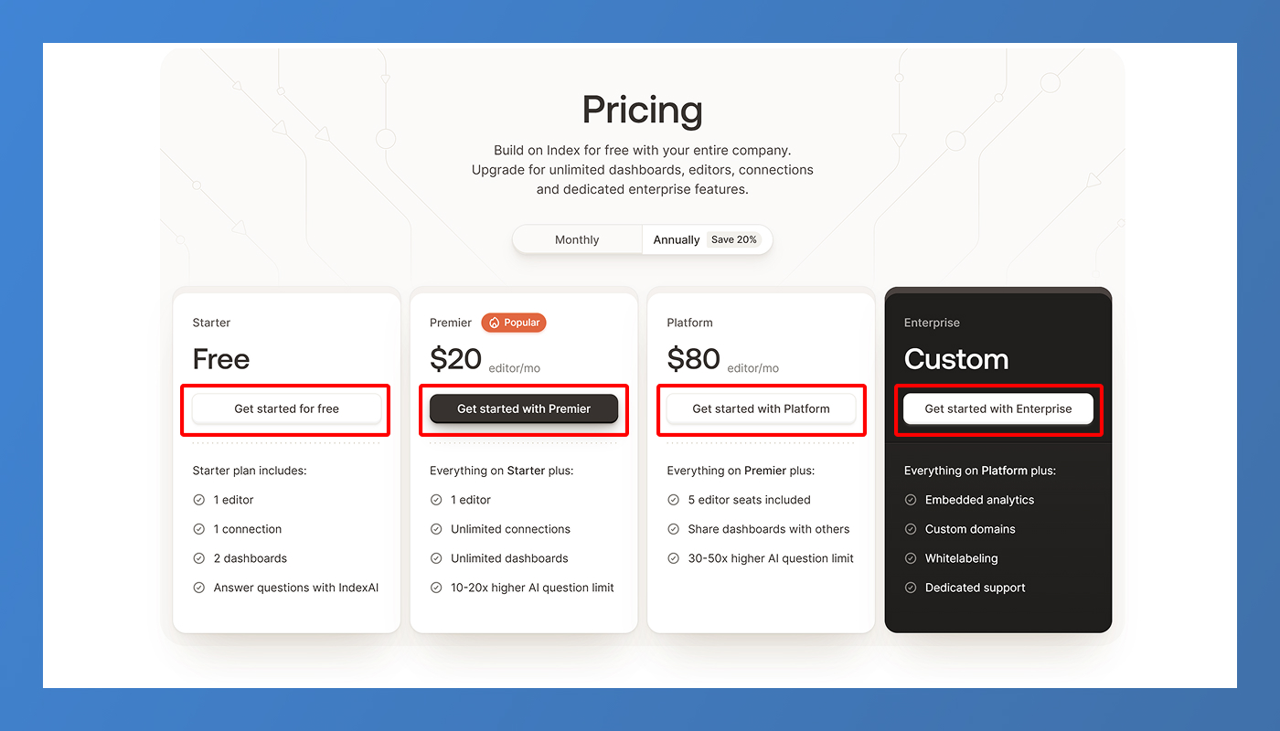
Generic CTAs like “Submit” or “Buy Now” don’t convert as well as CTAs with natural, outcome-focused language.
Instead, use:
- “Start Free Trial.”
- “Upgrade Now.”
- “Contact Sales.”
Ensure the CTA matches the user intent. For example, enterprise plans should lead to a “Request a Demo” or “Talk to Sales” flow, not a direct checkout.
10. Don’t Forget an FAQ Section
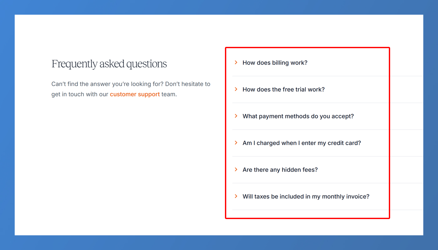
Under your pricing table, add a clear and concise FAQ section addressing common concerns such as:
- Can I cancel anytime?
- Are there hidden fees?
- Can I upgrade or downgrade later?
- Is my data secure?
Answering these preemptively prevents potential customers from leaving your site to find answers elsewhere.
11. Make It Mobile-Friendly
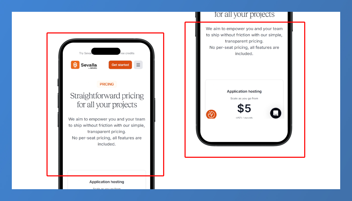
Always check how your pricing page looks and functions on mobile devices. Key areas to test:
- Do plans stack logically with clear readability?
- Are CTA buttons large enough to tap easily?
- Does the feature table remain accessible and scannable?
Don’t rely only on preview tools; test it on real devices to ensure a seamless mobile experience.
12. Support, Security, and Custom Options
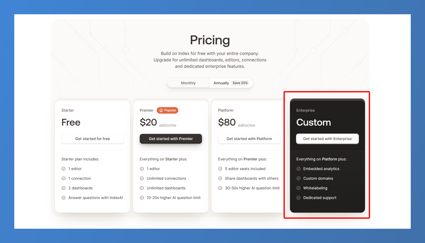
For SaaS apps targeting B2B, these are must-haves:
- Priority support details for higher plans.
- Security and compliance badges (e.g., GDPR, SOC2) to build trust.
- A “Custom Plan” or “Talk to Sales” option for enterprise users with unique requirements.
This caters to every user segment visiting your page and removes limitations from your sales pipeline.
13. Quick Checklist Recap
Here’s your high-converting SaaS pricing page checklist:
✅ Monthly & yearly toggle
✅ Usage-based pricing slider (if relevant)
✅ Feature comparison table
✅ Highlighted “Most Popular” or “Best Value” plan
✅ Visible trial or guarantee
✅ Clear and natural CTA buttons
✅ Real testimonials near pricing
✅ Competitor comparison table
✅ FAQ section below pricing
✅ Custom plan or contact sales option
✅ Fully mobile responsive design
Conclusion
Your pricing page is not just another page on your website – it’s the core driver of conversions for your SaaS business. By focusing on clarity, trust, and strategic design, you can transform it from a passive display into an active selling tool that drives revenue consistently.
Before publishing, test it with real users. Ask them:
- Which plan would you choose, and why?
- What’s confusing or missing?
- How does this page make you feel about the brand?
Often, small changes in CTAs, layout, or explanation can unlock significant conversion improvements.
FAQ
Q1: Why do SaaS pricing pages need feature comparison tables?
Because users need clear, quick comparisons to understand plan differences without frustration or confusion.
Q2: How often should I update my pricing page?
Ideally every quarter to reflect new features, competitor movements, or updated offers for higher conversion opportunities.
Q3: Is a usage-based slider necessary for every SaaS?
No, only if your pricing depends on usage metrics like seats, storage, or transactions. Otherwise, static plans work fine.
Q4: Should I openly compare my product with competitors?
Yes, if done respectfully. It builds user confidence and prevents them from leaving your site to research alternatives.
Q5: What’s the biggest mistake SaaS companies make on pricing pages?
Using generic CTAs and failing to clearly explain plan differences, leaving users confused about what they’re paying for.

Table of Contents
Choose Our Service, Grow Fast!
Follow Us


Related Posts
June 17, 2026
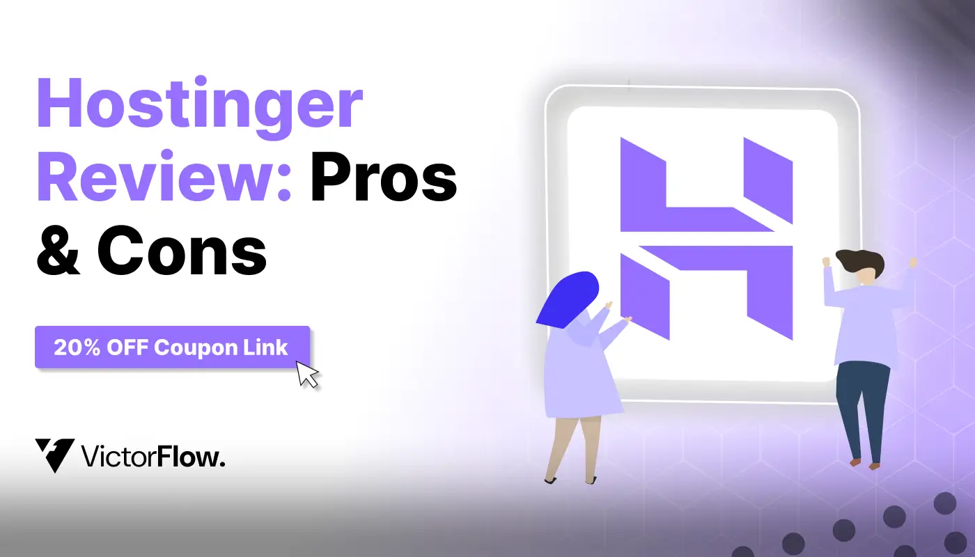
Hostinger Review 2026: Find pros, cons & a valid 20% OFF coupon! Get a discount on web hosting or VPS hosting. Exclusive coupon code inside!
Hostinger Review 2026: Find pros, cons & a valid 20% OFF coupon! Get a discount on web hosting or VPS hosting. Exclusive coupon code inside!
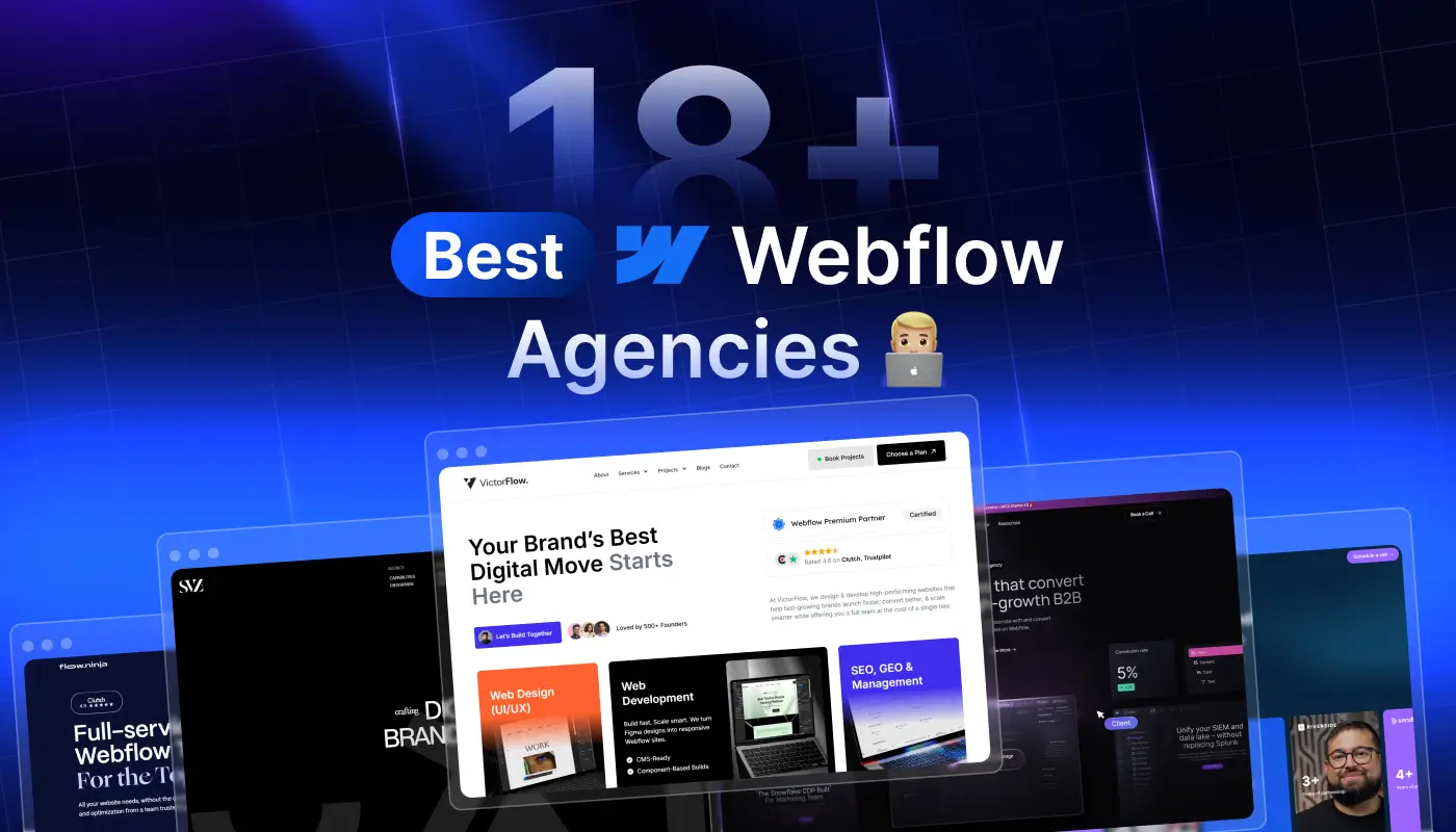
Compare 18+ best Webflow agencies in 2026, vetted by experts. Find the right partner by specialty, budget, and project type. From startups to enterprise.
Compare 18+ best Webflow agencies in 2026, vetted by experts. Find the right partner by specialty, budget, and project type, from startups to enterprise.

June 16, 2026
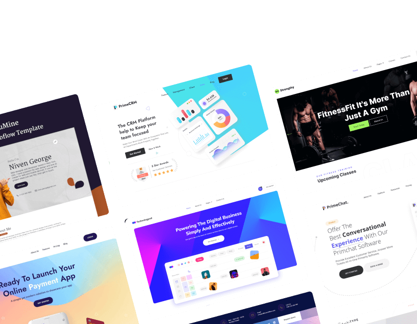
Launch faster with 38+ free Webflow templates for 2026. SEO-friendly designs built for startups, agencies, and businesses.
Launch faster with 38+ free Webflow templates for 2026. SEO-friendly designs built for startups, agencies, and businesses.
Ready to Scale Your Project to the Next Level?
Let's take your project to new heights, reach out and see how we can help you.


Top-rated by customers


