November 28, 2025
Is Subtle Design Better? Webflow Test Results | Bold vs Minimalist

Minimalist or bold - your Webflow design choice matters more than you think. It influences everything from load time and bounce rate to SEO rankings and conversions.
This post compares bold visuals and minimalist Webflow templates to uncover which performs better in real-world conditions.
Minimalist Webflow designs, on the other hand, focus on clarity, whitespace, and speed. We tested both styles using live Webflow builds to measure engagement, mobile responsiveness, and Core Web Vitals.
Results showed that design style affects not just aesthetics but also how users navigate, interact, and convert across devices. Performance metrics such as page speed and SEO visibility varied significantly depending on design complexity and visual hierarchy.
From startups to creatives, anyone building a Webflow site will benefit from these findings. Use this guide to make smarter Webflow design decisions backed by test data, not just design trends.
"Looking for expert help to create a high-performing Webflow site?
Get a free strategy session & launch with confidence."
Table of Contents
- What is Bold Visuals?
- What is Minimalist Design?
- Why Webflow Design Style Matters?
- Like & Dislike of Webflow Design
- We Tested 10 Rounds between Bold Visuals vs Minimalist Design
- The Winner is?
1. What is Bold Visuals?

Bold visual design in Webflow refers to a style that uses strong colors, striking typography, oversized elements, and high-contrast layouts to create immediate impact.
This approach grabs attention quickly and is often used in portfolios, creative agency sites, or promotional pages where storytelling and visual identity are key.
Designers who favor bold visuals typically use large hero images, animated elements, layered textures, and unconventional grid structures. These techniques can make a website memorable, emotionally engaging, and brand-driven.
In Webflow, bold designs are often built using custom interactions, scroll-based animations, and dynamic transitions. While these features elevate the visual experience, they also require careful planning to maintain performance and accessibility.
2. What is Minimalist Design?

Minimalist Webflow design focuses on simplicity, clean layouts, and a “less is more” philosophy. It emphasizes clarity by using ample white space, limited color palettes, and streamlined typography to guide user attention without distraction.
Instead of visual overload, this approach relies on purposeful spacing, intuitive navigation, and well-organized content. Every element serves a specific function, reducing clutter and improving usability across devices.
In Webflow, minimalist templates often include grid-based layouts, lightweight animations, and fast-loading assets.
These design choices contribute to stronger Core Web Vitals and better SEO performance by prioritizing speed and content focus.
3. Why Webflow Design Style Matters?
The design style you choose in Webflow directly affects how users perceive your brand, interact with your site, and convert into customers. It’s not just about aesthetics - it’s about function, clarity, and performance.

1. Impacts User Experience
Your chosen design style influences how users navigate, engage, and interact with your site.
2. Affects SEO Performance
Layout, speed, and structure directly influence rankings in search engines.
3. Drives Conversion Rates
Clean, focused design can guide users to take action more effectively than visually cluttered pages.
4. Controls Perception of Brand
Bold visuals may evoke energy and creativity, while minimalist styles suggest professionalism and clarity.
5. Enhances Mobile Responsiveness
Simpler designs typically load faster and adapt better to mobile screens, improving overall usability.
6. Aligns with Business Goals
The right style supports your site's purpose - be it storytelling, selling, or showcasing work - while maintaining strong Webflow site performance.
4. Like & Dislike of Webflow Design
What I Like:
✔ Complete design freedom: Build fully custom layouts and interactions without writing complex code.
✔ Visual editor with real-time preview: Easily see changes live as you design, speeding up workflow.
✔ Built-in CMS: Manage blogs, portfolios, or team pages with dynamic content and custom collections.
✔ SEO-friendly structure: Clean code, editable meta tags, and fast-loading pages help improve search rankings.
✔ Responsive by default: Designs automatically adapt to mobile, tablet, and desktop screen sizes.
What I Dislike:
❌ Steep learning curve: New users may find the interface overwhelming without prior design experience.
❌ Limited advanced SEO tools: No built-in automation for schema markup or large-scale SEO campaigns.
❌ Heavier designs can slow performance: Overuse of animations or images may impact load times if unoptimized.
❌ CMS has structural limits: Custom filtering, sorting, or very large content libraries may require workarounds.
❌ eCommerce features are basic: Compared to platforms like Shopify, Webflow’s store tools are more limited.
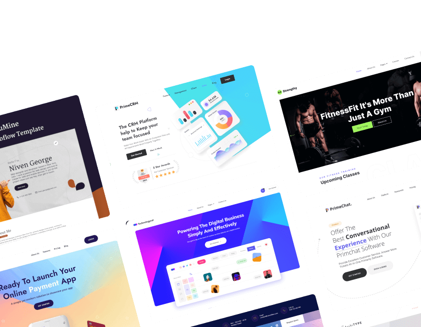
5. We Tested 10 Rounds between Bold Visuals vs Minimalist Design
.webp)
Round 1: First Impression & Visual Impact
Bold Visuals
Bold Webflow designs use vibrant colors, oversized text, and dramatic visuals to create an immediate emotional response.
They’re ideal for branding-heavy websites that need a strong personality. Attention-grabbing layouts can make a lasting impression but may overwhelm certain users.
Minimalist Design
Minimalist Webflow templates rely on whitespace, clean lines, and subtle typography for a calm, professional look.
They promote clarity and trust right from the first click. This style supports fast scanning and keeps the focus on your core message.
Final Verdict
Tie, both styles leave an impact - bold for memorability, minimalist for clarity. The best choice depends on your brand’s goals.

Round 2: Page Speed & Load Time
Bold Visuals
Bold Webflow designs often include large images, videos, and animations that can slow down page load times if not optimized.
Heavy visual assets may impact mobile performance and hurt Core Web Vitals. Performance issues can affect SEO rankings and bounce rates.
Minimalist Design
Minimalist Webflow templates use fewer assets, cleaner code, and lighter layouts for faster load times.
They naturally support better mobile responsiveness and often score higher in Google PageSpeed Insights. Leaner designs lead to a smoother user experience.
Final Verdict
Minimalist Design Wins, speed and performance favor minimalism, especially for SEO, mobile, and user retention.

Round 3: Mobile Responsiveness
Bold Visuals
Bold Webflow designs often include oversized images, layered content, and motion effects that can challenge mobile responsiveness.
These elements may require extra media queries or manual tweaks to avoid layout breakage on smaller devices. Poor scaling can affect user engagement and performance scores.
Minimalist Design
Minimalist Webflow templates are built with clean structures, limited content blocks, and flexible grid systems.
Their simplicity leads to more consistent rendering across screen sizes and better mobile usability. These layouts reduce the chance of overflow, zooming issues, or long scroll fatigue.
Final Verdict
Minimalist design wins this round for delivering superior mobile adaptability, which is essential for maintaining strong user experience, faster site speed, and better SEO performance on all screen sizes.

Round 4: SEO Performance
Bold Visuals
Bold Webflow designs rely heavily on visuals and animations, which can sometimes slow load times and impact Core Web Vitals.
If alt text, hierarchy, or semantic structure is overlooked, it may affect search engine visibility. They require careful optimization to remain SEO-friendly.
Minimalist Design
Minimalist Webflow templates typically feature clean HTML, fast load speeds, and simple structures that align with technical SEO best practices.
Less clutter improves crawlability, reduces layout shifts, and supports better indexation of key content by search engines.
Final Verdict
Minimalist design wins this round for offering a naturally optimized SEO structure, which is essential for achieving faster page load times, improved crawl efficiency, and stronger search engine rankings.

Round 5: Branding Strength
Bold Visuals
Bold Webflow designs immediately establish brand identity through custom illustrations, animations, and colors. They’re ideal for differentiation in crowded markets but may not be universally appealing.
Minimalist Design
Minimalist Webflow templates focus on subtle branding, where simplicity enhances a professional tone. This approach can be more versatile but may feel too generic for some brands.
Final Verdict
Bold design wins this round for offering strong brand recall, which is vital for memorable identity and market impact.

Round 6: Animation Use
Bold Visuals
Bold Webflow templates frequently leverage scroll animations, hover effects, and micro-interactions. These can enrich storytelling and make interfaces memorable.
Minimalist Design
Minimalist designs use minimal or no animation to prioritize speed and simplicity. This keeps attention on core tasks but may reduce engagement.
Final Verdict
Bold design wins this round for bringing interactivity and visual depth when used strategically.

Round 7: Ease of Navigation
Bold Visuals
Bold Webflow sites sometimes use complex or experimental layouts that may be visually engaging but hard to navigate. Unique menu placements and motion-heavy interfaces can confuse new users.
Minimalist Design
Minimalist Webflow templates stick to familiar patterns, intuitive menus, and logical content flow. This makes it easier for users to browse and locate information efficiently.
Final Verdict
Minimalist design wins this round for offering a smoother navigation experience, leading to higher usability and lower bounce rates.

Round 8: Design Flexibility
Bold Visuals
Bold templates give designers space to explore artistic freedom, visual storytelling, and experimentation. They are perfect for custom interactions and unique layouts.
Minimalist Design
Minimalist templates focus on restraint, which can limit bold expression but encourages consistency. They often rely on existing grid systems and patterns.
Final Verdict
Bold design wins this round for encouraging creative freedom and innovation in layout strategy.

Round 9: Template Versatility
Bold Visuals
Bold templates are usually niche-specific (e.g., creative portfolios, agency pages) and harder to adapt for other industries. Their unique visuals may require major edits for reuse.
Minimalist Design
Minimalist templates suit a wide range of industries, from tech startups to SaaS platforms and blogs. They provide a blank canvas with broad flexibility.
Final Verdict
Minimalist design wins this round for its universal applicability across different business types.

Final Round: Portfolio Showcase Capability
Bold Visuals
Bold Webflow designs shine in creative industries, allowing visual storytelling that highlights work with motion, depth, and style. They’re ideal for designers, artists, and agencies wanting to impress.
Minimalist Design
Minimalist templates provide a clean backdrop that puts the work at the center without visual interference. Perfect for showing off high-quality content, especially photography or writing.
Final Verdict
Bold design wins this round for being better suited to creative portfolio presentations, where style matters as much as substance.
6. The Winner is?

Bold Design brings high-impact visuals, interactive storytelling, and strong brand identity, perfect for creative professionals, agencies, or campaign-driven sites that rely on emotional engagement and memorability. It thrives where expression matters most.
Minimalist Design, on the other hand, champions clarity, speed, and user experience. It excels in technical SEO, mobile responsiveness, and ease of navigation, making it ideal for product-focused brands, SaaS platforms, and content-heavy websites.
Each style dominates in specific scenarios:
- Bold Visuals suit standout brands aiming for attention.
- Minimalist Design empowers lean, performance-focused creators.
Note: "In the end, your ideal style depends on your project’s intent, technical scope, and branding needs."

FAQ
1. Which design style is better for SEO?
Minimalist design typically outperforms due to faster load times, clean code, and fewer distractions, all of which align with technical SEO best practices.
2. Are bold visuals bad for performance?
Not inherently. Bold visuals can be optimized with proper image compression, lazy loading, and animation control. The issue arises when visuals are overused or unoptimized.
3. Can I combine both styles in one Webflow project?
Absolutely. A hybrid approach can balance brand personality with clarity, using bold elements selectively within a minimalist framework.
4. Which design works better for mobile users?
Minimalist layouts are usually more mobile-friendly due to their simple structures and fewer moving parts. Bold designs may need more tweaking to ensure mobile responsiveness.
5. Do bold designs convert better?
They can, especially when aimed at emotional engagement or product launches. However, minimalist designs often lead to smoother user journeys, boosting long-termconversion rates.
6. Which is faster to build in Webflow?
Minimalist templates are generally quicker to implement and customize, while bold designs might require more advanced layout control and asset handling.

Table of Contents
Choose Our Service, Grow Fast!
Follow Us


Related Posts

Compare 18+ best Webflow agencies in 2026, vetted by experts. Find the right partner by specialty, budget, and project type. From startups to enterprise.
Compare 18+ best Webflow agencies in 2026, vetted by experts. Find the right partner by specialty, budget, and project type, from startups to enterprise.
.webp)
Hiring a Webflow agency? Learn how to choose the right partner, compare agency vs freelancer, understand pricing, and avoid costly mistakes in this complete 2026 guide for SaaS & B2B teams.
Hiring a Webflow agency? Learn how to choose the right partner, compare agency vs freelancer, understand pricing, and avoid costly mistakes in this complete 2026 guide for SaaS & B2B teams.

June 17, 2026
Hostinger Review 2026: Find pros, cons & a valid 20% OFF coupon! Get a discount on web hosting or VPS hosting. Exclusive coupon code inside!
Hostinger Review 2026: Find pros, cons & a valid 20% OFF coupon! Get a discount on web hosting or VPS hosting. Exclusive coupon code inside!
Ready to Scale Your Project to the Next Level?
Let's take your project to new heights, reach out and see how we can help you.


Top-rated by customers


© 2026 VictorFlow (A Unit of UIXFlow Private Limited), All Rights Reserved