November 18, 2025
How to Design a Secure and Conversion-Focused FinTech Website With Webflow & Framer

Secure and conversion-focused FinTech websites require thoughtful planning that blends trust, clarity, and compliance into a consistent digital experience.
Strong FinTech platforms thrive when content and visuals help users understand financial products without unnecessary complexity or technical jargon.
Trust grows when the design emphasizes transparency through clear structures, stable interactions, and reliable system behavior. Credibility increases when websites adopt proven UX patterns alongside recognizable security cues that lower visitor hesitation.
Frictionless funnels encourage users to compare plans, submit forms, or begin onboarding without feeling confused or overwhelmed. Designers often rely on Webflow for its structured CMS, clean output, and control over responsive layouts across devices.
Framer supports advanced interaction design, enabling FinTech products to demonstrate features through motion and guided micro-experiences. Clear messaging becomes essential when communicating financial solutions that must meet regulatory and client confidence expectations.
Stable infrastructure reduces risk by ensuring users navigate securely without disruptions or unpredictable behavior. Combining security principles, UX clarity, and conversion strategy helps FinTech brands build websites that inspire trust and drive consistent growth.
"Secure your FinTech website today.
Book a free strategy call to plan your upgrade."
Table of Contents
- Craft a powerful first impression with your hero section.
- Build credibility through trust elements.
- Highlight security measures and regulatory compliance.
- Showcase product features clearly.
- Simplify the user journey with a "How It Works" section.
- Make pricing transparent.
- Answer common concerns with an FAQ section.
- Reinforce credibility with a structured footer.
- Optimize calls to action for better conversions.
1. Craft a Powerful First Impression with Your Hero Section

The hero section is the first thing users see when they land on your website — and first impressions matter. Here’s what makes a perfect hero section:
- Clear Headline: Communicate your product’s value right away. Avoid vague statements. For example:
- Instead of: "A Smarter Way to Manage Money."
- Try: "Send, Save, and Invest in One Secure App."
- Subheading: Reinforce the product’s key benefits in a short, concise sentence.
- Call to Action (CTA): Encourage immediate action with a strong CTA, like "Get Started Today" or "Create Your Account."
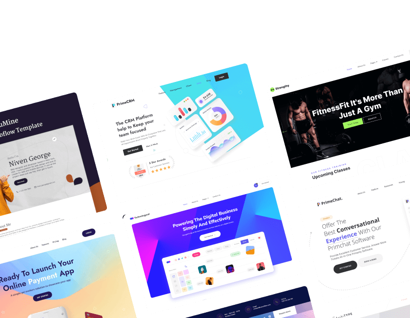
- Visual Representation: Include a dashboard screenshot, mobile app interface, or demo video to give users a glimpse of the product.
2. Build Credibility Through Trust Elements

In FinTech, trust is everything. To build credibility:
- Logos of Partners and Certifications: Highlight collaborations with banks, financial institutions, or security certifications.
- Media Mentions: Show off any press coverage from major outlets like Forbes or TechCrunch.
- User Testimonials and Case Studies: Real stories from satisfied users help build confidence.
3. Highlight Security Measures and Regulatory Compliance

People won’t trust a financial platform unless they feel safe using it. Here’s what to include:
- Key Security Measures: Emphasize features like data encryption, two-factor authentication (2FA), and fraud detection.
- Compliance Information: Clearly state your adherence to financial regulations and industry standards.
- Trust Badges: Include recognizable symbols that indicate secure transactions and compliance.
4. Showcase Product Features Clearly

FinTech products often come with many features. To avoid overwhelming users:
- Feature Breakdown: Present features in digestible sections or interactive tabs.
- User Benefits: Focus on what each feature does for the user. For example:
- Instead of: "AI-Powered Investing."
- Try: "Automate Your Investments with AI-Powered Portfolio Management."
5. Simplify the User Journey with a "How It Works" Section

Make the process simple and easy to follow:
- Step-by-Step Format: Break down the process into three or four clear steps.
- Example: "Sign Up → Verify Identity → Start Transacting."
- Visual Aids: Use icons or graphics to represent each step.
6. Make Pricing Transparent

Hidden fees drive users away. Be upfront:
- Clear Pricing Tables: Compare pricing tiers side-by-side.
- Highlight Free Options: If you offer a free plan, make it obvious.
- No Surprises: Avoid small print and hidden disclaimers.
7. Answer Common Concerns with an FAQ Section

Address users’ questions before they even have to ask:
- Group FAQs by Category: Make it easy for users to find answers.
- Common Questions: Cover topics like security, fees, account verification, and transaction limits.
8. Reinforce Credibility with a Structured Footer

The footer isn’t just a place for links — it’s a trust-building tool:
- Support Information: Include contact options and support channels.
- Legal Disclaimers: Link to privacy policies, terms of service, and regulatory licenses.
- Quick Links: Provide easy access to security policies, compliance info, and press coverage.
9. Optimize Calls to Action For Better Conversions

Finally, ensure your CTAs are clear and consistent:
- Primary CTA: Stick with one primary CTA throughout the site, like "Sign Up" or "Get Started."
- CTA Placement: Include CTAs at the end of each section to encourage continuous action.
Conclusion
Secure FinTech design focuses on safeguarding user data while presenting information through clear and trustworthy layouts. Conversion performance improves significantly when paths are simplified and visitors understand where to go next without hesitation.
Stronger trust emerges when financial services use consistent branding, structured content, and visible security indicators. User journeys become far more predictable when advanced interactions guide attention toward sign-ups or product exploration.
Cleanly optimized design ensures visitors feel confident as they engage with forms, calculators, or plan comparisons. Modern builders like Webflow and Framer help maintain regulatory awareness while enabling creative freedom for high-impact layouts.
Performance enhancements further support stability, making financial platforms both responsive and dependable across devices. FinTech brands that focus on security, clarity, and conversion strategy create websites that build loyalty and encourage long-term client relationships.

FAQ
1. What matters most when designing a FinTech website?
Security, clarity, trust-building visuals, and simplified conversion paths shape the best-performing FinTech experiences.
2. How does Webflow support secure FinTech design?
It provides structured CMS, clean code, fast hosting, and controlled layouts that reinforce stability and clarity.
3. Why is Framer useful for FinTech interfaces?
Its interaction tools help demonstrate financial features in a way that feels more intuitive and guided for new users.
4. Where should trust indicators be placed?
Badges, compliance notes, encryption markers, and testimonials work best near sign-up areas and core product pages.
5. Who benefits from a conversion-focused FinTech site?
Startups, lenders, payment apps, and advisory services gain stronger engagement through clearer funnels and faster flows.
6. How can a FinTech site reduce user hesitation?
Transparent messaging, stable visuals, predictable interactions, and visible security cues improve confidence quickly.


Choose Our Service, Grow Fast!
Follow Us


Table of Contents
Related Posts

July 8, 2026
Meet trusted Webflow care agencies specializing in optimization, speed monitoring, custom updates, and proactive issue prevention to protect your digital presence.
Meet trusted Webflow care agencies specializing in optimization, speed monitoring, custom updates, and proactive issue prevention to protect your digital presence.
July 8, 2026
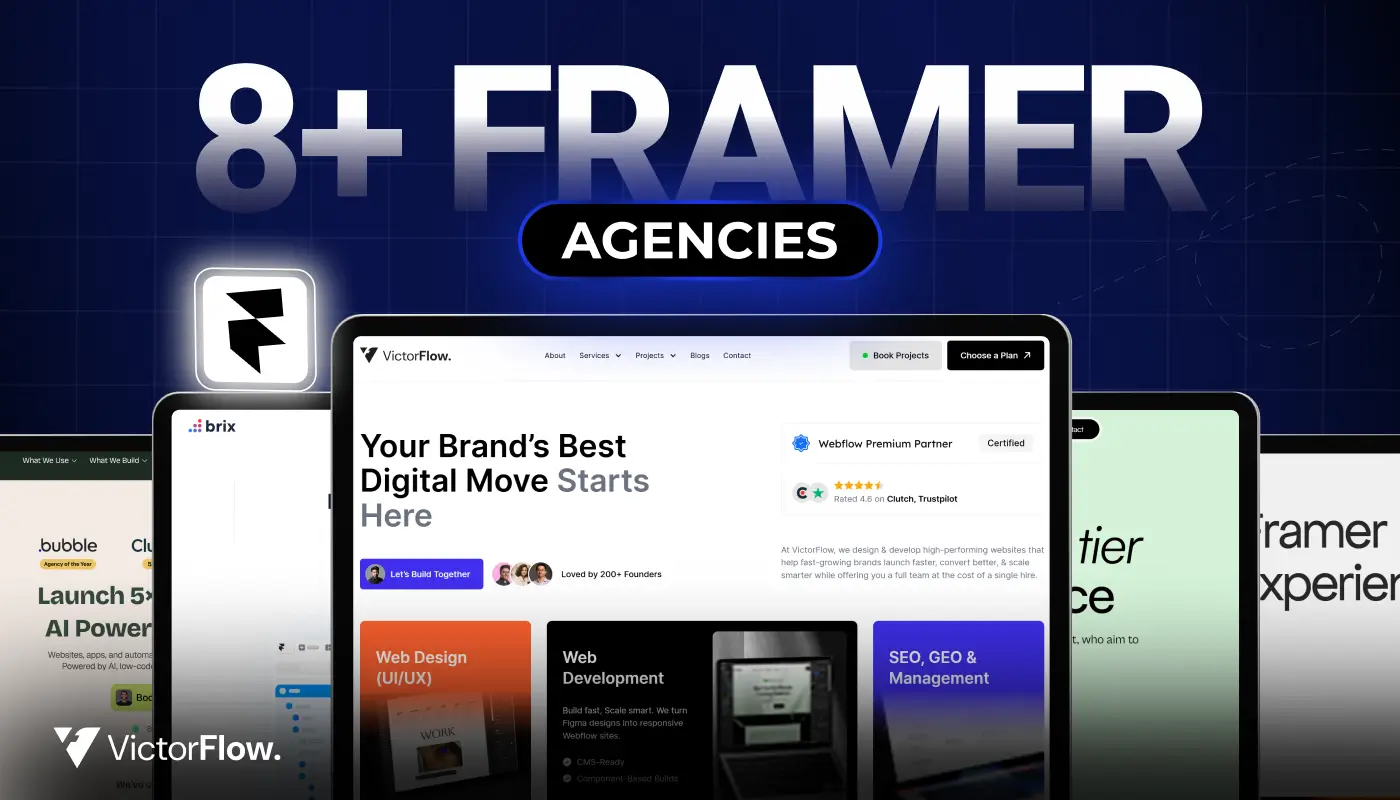
Find the best Framer agencies in 2026 for startups and brands. Compare top teams based on design, performance, and expertise.
Find the best Framer agencies in 2026 for startups and brands. Compare top teams based on design, performance, and expertise.
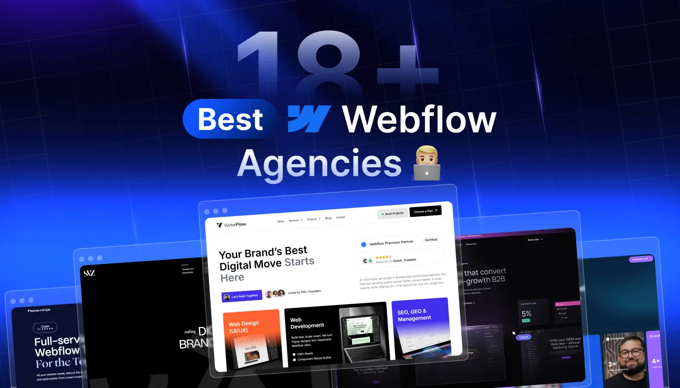
Compare 18+ best Webflow agencies in 2026, vetted by experts. Find the right partner by specialty, budget, and project type. From startups to enterprise.
Compare 18+ best Webflow agencies in 2026, vetted by experts. Find the right partner by specialty, budget, and project type, from startups to enterprise.
Ready to Scale Your Project to the Next Level?
Let's take your project to new heights, reach out and see how we can help you.


Top-rated by customers


