
On account of long-lasting visual impact, building a unique website demands tools that strike a balance between technical prowess and creative control. Webflow offers essential features that allow designers to craft unique layouts while maintaining responsive performance.
Its drag-and-drop interface delivers precision control that supports pixel-perfect designs without sacrificing flexibility. Advanced CMS options help organize dynamic content for blogs, portfolios, and scalable business platforms.
Responsive breakpoints ensure seamless visuals across desktops, tablets, and smartphones for consistent user experiences. Custom interactions and animations bring life to static pages, guiding visitors through captivating visual journeys.
SEO-ready settings make it easier to optimize pages for better rankings and stronger digital visibility. Hosting powered by fast global servers ensures quick load times and reliable site performance.
Powerful integrations extend functionality, allowing e-commerce, forms, and third-party tools to merge smoothly. These essential features give designers the freedom to create websites that feel personal, polished, and future-ready.
"Create stunning designs without limits.
Claim a free planning session to unlock Webflow’s powerful custom features now."
Table of Contents
- What’s Webflow?
- Webflow: CMS & Editor
- Define your Default Styles
- Where to begin: Template or Blank Canvas?
- Select a Template or Theme
- Adjust Spacing
- Browsers Support Features
- Webflow vs WordPress, Which is Better?
- Customize Your Website
1. What’s Webflow?
Webflow is a visual design tool followed by web designers. In case you've never heard of it, it converts your design choices into clear, production-ready code.
Designed to make it possible for designers, developers, and pretty much everyone else to construct responsive websites completely.

Using a "code-first" methodology, Webflow is an all-in-one online design tool that enables users to build with Webflow, Webflow design, to graphically design, process, develop, and deploy flexible websites.
2. Webflow: CMS & Editor
Another crucial element of Webflow is the CMS, which enables you to add content management and dynamic material of any kind.
Your first thought might be a blog, but you can also use it to create portfolios and a range of other original content.
If you're a developer, you'll appreciate using the API to make webhooks and functions that are even more effective.
Zapier can also be used to connect your CMS to external services like Twitter or Google Sheets. Webflow is a robust platform, whether or not you know how to write code.

The CMS can be activated by selecting the dashboard's stack icon to the left. To use it, create a collection, add items to it, and then add it to your website by utilizing the Collection List element in the Adding panel.
The Editor, which fully eliminates tiresome back-end editing, is an additional helpful tool.
If all you need is to change the content on your website without making any changes to the web design or layout, you do not need to log into the Designer.
You can access it by visiting your live site and clicking the Edit Site button in the lower-right corner. Toggle on those third-party cookies and make sure you are logged in.
The options available to the Designer will appear in a little toolbar at the bottom. Simply move the mouse pointer over the item you want to edit, then click the corresponding icon.
You can then change the text, modify the images, and edit the button links, among many other things.
3. Define your Default Styles

A few recurring components are constant throughout the design. However, you can change them to suit your brand's needs. By altering and restyling them, you can create default styles.
There are innumerable similar things, such as:
- Body \Paragraph
- Styles for quotations
- Logo placement and link colors
First, let's determine the typography and size for the Body (all pages). It will flow consistently throughout your website if you use the same font styling.
Additionally, one of the choices is responsive design. For PCs and smartphones, it adjusts the size according to the screen size.
Sounds difficult? Your bespoke design is assisted by Webflow developers by designating appropriate body styling.
Additionally, keeping track of specific style guidelines facilitates teamwork. Choose global colors since they can be changed easily.
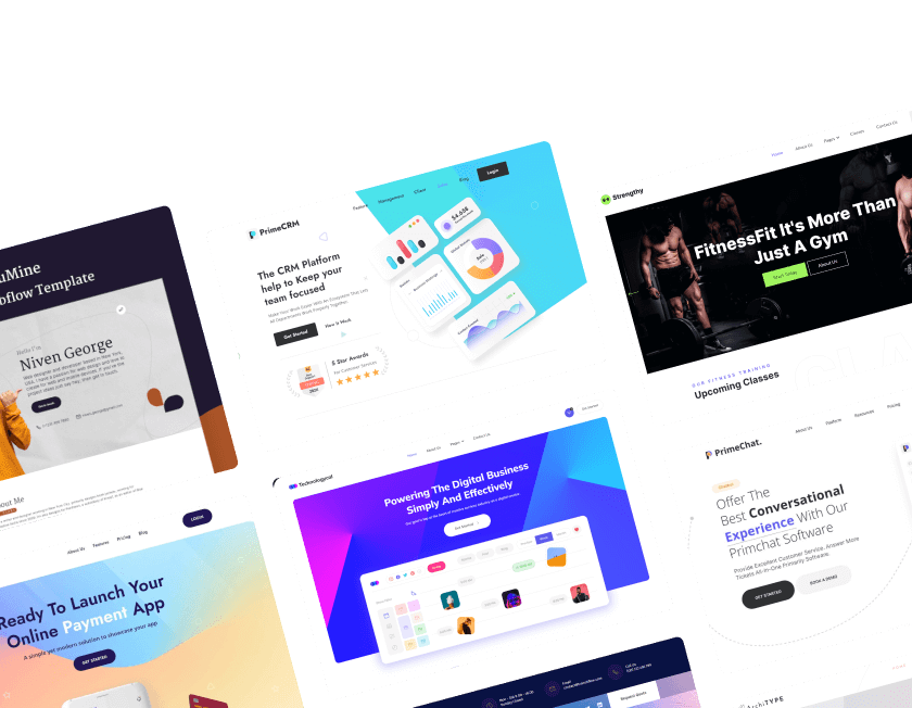
4. Where to begin: Template or Blank Canvas?

Even if you have no prior knowledge of web design, you can quickly create a quality website. Templates are the best option if you want to get a head start.
This provides you with a simple platform on which to develop your website. When designing it, Webflow also makes it simple to personalize the in-sight design and UX design for each component.
You can also use templates to learn how web design functions. You'll gain a deeper grasp of your website and best practices for web design in general by observing the structure and how the various pieces fit and function together.
Even a template created for a use other than what you intend to use it for can be used. It can be broken down and reassembled to suit your design requirements.
5. Select a Template or Theme
You will be sent to the template page after completing the Webflow inquiry. You may be required to learn here before working.
Click "Get Started" in the top right corner of your screen if you want to learn more; it will resemble the image below!
Following the instructions, get started by creating a demo website. You need a layout for your Webflow university website right here. Grids, containers, columns, and sections are the four options that will be available.
You will be taken to a page with several templates that you can use to design your Webflow Website if you choose not to learn. The bottom-right corner of each image will display the cost of the template.
Additionally, several templates can be found categorized as "New Templates," "Untied Templates," E-commerce, and many others. Select "Preview in Browser" from the menu to see how it will appear to visitors.

The individual can attain the same goal at the same time by traveling through the Webflow website to track the web in the same manner as the website.
6. Adjust Spacing
The white space beneath the header has to be reduced now that we've introduced a new element. Changing the bottom margin is possible by clicking on the header element.
In the element styles panel on the right, under "Spacing," are the margins. The lower margin in the preview panel will be colored blue when you hover over it. Its current value is 100px.

The margin may then be changed in the preview window in real time by clicking and dragging it there or by clicking and typing the desired value. Change the margin to about 50px using the technique you like.
Our newly created section now needs a bottom margin, so click on it and follow the instructions again to add a 50px margin. This is what ought to happen.
7. Browsers Support Features
The next step is to examine the responsiveness of your Webflow website on mobile devices and other browser support features. Try testing your Webflow website on as many different devices as possible, as it should be device-friendly.
If you don't have access to many different devices, the Webflow tools listed below can assist you in adding browser support capabilities to your website.
Accessibility
Accessibility for people with disabilities includes those who use the internet. Everyone, especially those who have difficulty hearing, seeing, or navigating online, should be able to view your Webflow website design.
Make your website more accessible by using Webflow tools. However, if you encounter any issues, you can hire a Webflow designer through a reputable Webflow-based development firm like Webflow Website Solutions.
SEO
Ensure that the indexing of your Webflow free subdomain is turned off in your project settings. For each page of your website, you can also specify the names and descriptions based on SEO.
SEO-based content can raise the ranking of your website and bring in more visitors. To get the job done, you may need a team comprised of Webflow designers, digital marketing specialists, and website content writers.

8. Webflow vs WordPress, Which is Better?

Yes, Webflow is superior to WordPress since it allows for total creative flexibility, as opposed to WordPress's coding restrictions.
The Webflow design builds with Webflow, Webflow design as opposed to a Webflow template in restriction.
Additionally, Webflow can help you create high-quality code and an amazing user experience; however, WordPress has a large requirement for plugins that can clog up the code.
It is advised that both small and large businesses create websites based on their workflow.
9. Customize Your Website
From this point forward, your work as a Webflow designer begins! Numerous modifying options are available, ranging from choosing the layout to adding information.
Choose the layout, components, and symbols first before beginning to add content to your Webflow website.

- Webflow Adding Elements
- We should begin by adding items to Webflow.
- Click the Add menu item in the sidebar to add elements to Webflow. Then, click the Elements tab. There are numerous layout options available here. Choose the best option, then continue with the progress.
Adding Sections
A screen-spanning layout component is represented by sections, which is perfect for backdrop photos, movies, and other content. The instructions below will help you add sections to your Webflow website.
- Select "Add" from the menu on the left sidebar.
- The Elements and Layout area will appear once you choose to Add. Select the Section tab that appears in the Layout section now.
- After that, drag the piece to the desired website place.
- After finishing the section's addition to your website, tap it and select the right-hand menu to change the section's size and add content. You can add material by typing or by dragging and dropping files.
Conclusion
Webflow’s essential features deliver unmatched freedom to design websites that combine style and technical strength. Responsive controls allow seamless experiences across devices while preserving visual consistency and impact.
Dynamic CMS technologies make scaling and upgrades easier for projects that keep expanding over time. Custom animations and interactions keep visitors engaged through motion and well-timed visual elements.
Clean code and quick hosting produce a platform designed for long-term performance, dependability, and speed. Built-in SEO tools help websites reach wider audiences through stronger visibility in search results.
Creators may extend functionality to meet changing design and business needs thanks to flexible connectors. These core elements empower designers to produce websites that stand out and leave lasting impressions.
By 2026, there will be countless creative possibilities for large-scale digital projects when these qualities are used.

FAQ
1. What makes Webflow ideal for custom websites in 2026?
Webflow combines design flexibility, responsive controls, and built-in hosting to create professional custom websites without coding barriers.
2. Can Webflow handle large, content-rich projects?
Yes, the CMS supports dynamic content and scalable structures that make managing blogs, e-commerce stores, or portfolios easy.
3. Is Webflow suitable for fast-growing businesses?
Absolutely, its hosting infrastructure, integrations, and responsive design tools support growth while maintaining site performance.
4. Do I need advanced coding skills to use Webflow features?
No coding is required for most tasks, but developers can add custom code for advanced design and functionality when needed.
5. How does Webflow help improve search engine rankings?
Built-in SEO controls, clean code, and fast hosting contribute to stronger visibility and better performance in search results.
6. Can Webflow integrate with third-party tools?
Yes, Webflow supports integrations for analytics, forms, payments, and more to enhance website functionality and flexibility.


Choose Our Service, Grow Fast!
Follow Us


Table of Contents
Related Posts

July 22, 2026
SEO and social media help businesses attract clients faster by boosting visibility, building trust, and creating consistent engagement across multiple online channels.
SEO and social media help businesses attract clients faster by boosting visibility, building trust, and creating consistent engagement across multiple online channels.
.webp)
Hiring a Webflow agency? Learn how to choose the right partner, compare agency vs freelancer, understand pricing, and avoid costly mistakes in this complete 2026 guide for SaaS & B2B teams.
Hiring a Webflow agency? Learn how to choose the right partner, compare agency vs freelancer, understand pricing, and avoid costly mistakes in this complete 2026 guide for SaaS & B2B teams.
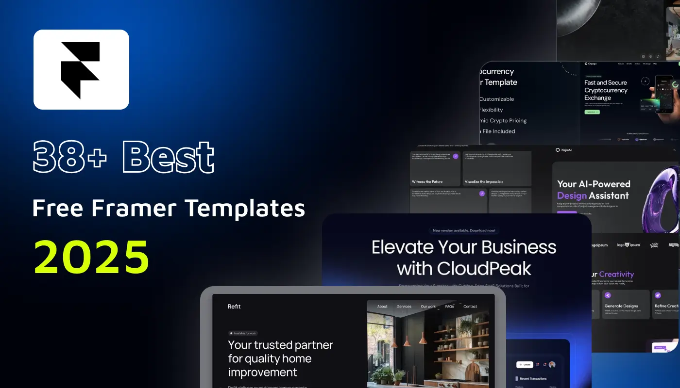
Explore 38+ free Framer templates for 2026. Discover handpicked, responsive, and customizable website templates you can clone, edit, and launch in minutes.
Explore 38+ free Framer templates for 2026. Discover handpicked, responsive, and customizable website templates you can clone, edit, and launch in minutes.
Ready to Scale Your Project to the Next Level?
Let's take your project to new heights, reach out and see how we can help you.


Top-rated by customers


© 2026 VictorFlow (A Unit of UIXFlow Private Limited), All Rights Reserved