January 2, 2026
10 Outstanding Webflow Websites Showcase its Greatest Possible in 2026

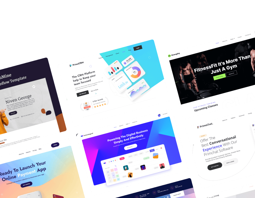
Innovative Webflow websites demonstrate what is possible with design and interactivity. These sites combine style, performance, and usability to create memorable online experiences.
Responsive layouts ensure content looks great on mobile, tablet, and desktop devices. Animations and interactions are carefully crafted to enhance engagement without distraction.
Creative use of grids and sections organizes content beautifully for visitor clarity. Modern Webflow features allow designers to experiment while maintaining smooth performance.
Showcases highlight how design choices impact user perception and brand authority. The choice ideas from reputable websites aids in creating an interesting project of your own.
"Boost engagement by applying proven design patterns in Webflow.
Reserve your free site evaluation now."
Table of Contents
- Okalpha
- Conservation Guide
- Health-Ade
- Mack & Pouya
- Ujet
- Emma.ca
- Foudamour
- The Goonies
- Memberstack
- Wannabe Toys
1. Okalpha

Okalpha, based on your description, seems to have excelled in creating a user-friendly and informative website. Here's a breakdown of the different aspects that make their website successful:
- Visual Appeal: They've used a vibrant color palette and interactive 3D elements to make the website visually engaging and fun to explore. This creates a positive first impression and keeps visitors interested.
- Attention to Detail: Subtle details like 3D button animations add a delightful touch that reinforces their brand identity. These small details show that Okalpha cares about the user experience and has put thought into creating a cohesive brand image.
- Clarity and Conciseness: The text on the website is streamlined, keeping things clear and concise. This avoids information overload and ensures that visitors can easily understand the information presented.
- Accessibility: A handy slide-in window with more details appears when clicking on any service. This makes information easily accessible to users without cluttering the main page.
- Balance: The website strikes a perfect chord between playful and professional. This balance reflects Okalpha's unique approach and makes the website both engaging and informative.
Overall, Okalpha's website seems well-designed and achieves its goal of showcasing its work and company in a positive light.
2. Conservation Guide

Conservation Guide website, but I can't share links directly. However, based on the information you've provided and what I know about Conservation Guide, here's a summary of what you can expect on their website:
Focus on Conservation Opportunities:
- Conservation Guide is a platform designed to help you find high-quality conservation projects around the world.
- The website prioritizes this goal by placing a search bar prominently for easy access.
Engaging and Informative Experience:
- The website utilizes a full-width video background to capture your attention.
- Interactive design elements and subtle animations (like the hermit crab!) keep browsing enjoyable.
- Despite being content-rich with maps, programs, and a blog, it seems well-organized for easy navigation.
Conservation Guide's website appears to be a valuable resource for anyone interested in getting involved with conservation efforts.
3. Health-Ade

Health-Ade website, but I can't share links directly. However, based on the information you provided and what I know about one-page websites with landing page techniques, here's more about what you might find:
Focus and Impact:
- The website is likely designed to be concise and impactful, guiding you towards a specific action, perhaps buying their kombucha.
Visual Appeal:
- Expect engaging animations and scrolling effects that keep you interested as you explore the page.
Key Information Highlighted:
- The animations might draw your attention to important details about Health-Ade's products and brand story.
Easy Purchase:
- A "Shop Now" button that stays visible throughout your visit makes buying their kombucha convenient.
Simple Navigation:
- Although it's a single page, it should be easy to navigate and find the information you're looking for.
If you'd like to learn more about Health-Ade and their kombucha, search for "Health-Ade kombucha" on the web.
4. Mack & Pouya

Mack & Pouya's photography website is unique and successful based on the description:
- Playful and Engaging Design: The website boasts a playful, bright, and unique design that sets it apart from the competition. This likely creates a positive first impression and grabs visitors' attention.
- Enchanting Visuals: Hover effects that give the photographs a 3D feel add another layer of engagement and make browsing the website an interactive experience.
- Functionality Meets Fun:
- The "build your package" section on the homepage is a standout feature. It allows potential clients to get an immediate estimate for their wedding package in a fun and interactive way. This could include using sliders, toggles, and even interactive maps.
- Sound effects add another layer of playfulness to the experience.
- Seamless User Experience:
- The ability to save the customized package estimate directly to email allows for easy reference and follow-up. This demonstrates a user-friendly design that prioritizes the client's experience.
- Webflow's Potential Highlighted: The description suggests the website is built on Webflow, showcasing the platform's flexibility in creating unique and engaging web experiences.
Mack & Pouya's photography website seems like a great example of how to stand out in a competitive industry. It combines a visually stunning design with innovative features and a focus on user experience, making it a strong lead-generation tool.
5. Ujet

Ujet's website design reflects its brand identity based on the description:
- Cohesive Brand Experience: The website's look and feel directly mirrors the sleek and modern design of their e-scooters. This creates a consistent brand experience for visitors, reinforcing the image of innovation and high quality.
- Clean Interface Design: A clean interface design avoids clutter and keeps the focus on the product. This likely emphasizes the sleekness and modern aesthetic of Ujet's e-scooters.
- User-Friendly Navigation: Smooth animation, thoughtful layering, and seamless scroll effects contribute to a pleasant browsing experience. This user-friendliness reflects a brand that cares about customer experience.
6. Emma.ca

Emma.ca leverages Webflow to create a successful website for its target audience:
- Bilingual Accessibility: By building with Webflow, Emma.ca can easily manage both English and French-language versions of their website. This allows them to reach a wider audience of new and expectant parents across Canada.
- Targeted Content with Webflow CMS: The Webflow CMS empowers Emma's team to create engaging content specifically relevant to their target market. This content, like the baby name database, likely addresses the needs and interests of new and expectant mothers, potentially attracting organic search traffic.
- Informative and Visually Appealing: The website aims to be not only informative but also visually appealing. This balance likely creates a user-friendly experience for visitors seeking information about Emma's life insurance products.
Emma.ca seems to be a well-designed website that leverages Webflow's capabilities effectively.
By offering bilingual accessibility, targeted content creation, and a visually appealing design, the website positions Emma as a valuable resource for new and expectant parents considering life insurance options.
7. Foudamour

Foudamour's services, here's what you might experience on their website:
Elegant User Experience:
- Right upon landing (above the fold), you'll likely have the option to choose between viewing past events or learning more about Foudamour. This personalizes your browsing experience.
Visually Stunning Design:
- Expect large, high-quality images showcasing the beauty and elegance of Foudamour's wedding creations.
- Sophisticated typography complements the visuals, reinforcing their high-end brand image.
- Ample white space creates a clean and luxurious aesthetic, emphasizing the exclusivity they offer.
Subtle Engagement:
- The website might incorporate subtle animations where text and images layer on top of each other. This adds a touch of interactivity without being overwhelming.
- This animation effect, repeated throughout the website, likely creates a sense of cohesion and reinforces their brand identity.
Foudamour's website seems designed to reflect its brand perfectly. It offers user choice, prioritizes high-quality visuals, and uses subtle animations to create a luxurious and engaging experience, attracting potential clients seeking a refined wedding experience.
8. The Goonies

The Goonies website. While I can't share the link directly, based on the information you've provided, here's a recap of what you might experience:
Interactive Exploration:
- The website likely takes you on an adventure through the Goonies' world using a smooth scrolling effect.
- You can customize your experience by clicking on different sections, perhaps dedicated to each character.
Engaging Content:
- Clicking on characters might reveal details about them through text, images, and even video clips from the movie.
Fun and Playful Design:
- Animations and hover effects likely add interactivity and keep you engaged as you explore.
Award-Winning Quality:
- The website's mention of an Awwwards award suggests exceptional design and user experience.
If you'd like to see The Goonies website for yourself, you can search for "The Goonies Webflow website" on the web.
9. Memberstack

Memberstack's website is a strong example built with Webflow:
Seamless Integration:
- Being built with Webflow, Memberstack likely integrates seamlessly with the platform, offering a smooth user experience for both website creation and membership management.
Compelling Social Proof:
- The impressive testimonial slideshow with over 50 positive reviews builds trust and social proof, demonstrating the value Memberstack delivers to its customers.
Comprehensive Information:
- The service page likely provides a detailed explanation of everything you need to know about the Memberstack platform, making it easy for potential customers to understand its features and benefits.
Transparent Team:
- The "about us" section offers a glimpse into the Memberstack team, potentially showcasing their expertise and their mission to empower others with membership-based websites.
Memberstack's website seems to be a well-designed example that leverages Webflow's capabilities. By showcasing seamless integration, positive testimonials, comprehensive information, and a transparent team, the website effectively positions Memberstack as a valuable tool for building membership websites.
Additionally, since you previously mentioned you couldn't access the login page due to some issues, it's worth noting that Memberstack seems to be aware of this and is working on a resolution.
10. Wannabe Toys

Wannabe Toys' website sounds like a breath of fresh air in the online toy retailer landscape. Here's what makes it stand out:
- Unconventional and Engaging: The website breaks away from typical toy store designs with a fun and interesting approach, perhaps through the unexpected 3D skull element "above the fold" (the initial screen view). This interactive feature likely grabs attention and sets the tone for a unique shopping experience.
- High-End Presentation: Despite the fun elements, crisp photos and big writing likely contribute to a clean and sophisticated aesthetic. This approach complements the high-end and pricey nature of the toys themselves.
- Branding Through Design: The overall look and feel, likely built with Webflow, establishes Wannabe Toys as a brand that prioritizes quality and sophistication. This caters to a specific customer seeking unique and high-end toys.
- Standing Out from the Crowd: Compared to average online toy stores, Wannabe Toys positions itself as a premium destination through its website design.
Wannabe Toys' website seems like a great example of how design can be used to create a distinct brand identity. By offering a fun and interactive experience alongside a high-end presentation, the website effectively attracts a specific customer segment seeking unique and sophisticated toys.
Conclusion
The best Webflow websites combine aesthetics, performance, and usability seamlessly. Visitors stay longer when sites are visually engaging and easy to navigate properly.
Structured layouts improve readability and guide users to key content efficiently. Innovative interactions create memorable experiences that leave lasting impressions.
High-performing templates save time while delivering professional results instantly. Employing the best designs enhances your online brand identification and stimulates innovation.
Reviewing exceptional websites on a regular basis facilitates the implementation of tactics that actually work.

FAQ
1. What makes a Webflow website stand out in 2026?
Exceptional design, smooth animations, responsiveness, and user-friendly navigation make it memorable.
2. Can I replicate features from showcased websites easily?
Yes, Webflow’s visual editor allows customization and adaptation of layouts and interactions without coding.
3. Are these websites optimized for speed and mobile devices?
Absolutely, showcased sites are fully responsive and optimized to perform efficiently on all devices.
4. How can I get inspiration from these Webflow showcases?
Analyze layout, typography, interactions, and content organization to implement ideas in your own projects.
5. Do Webflow websites require coding skills to build?
Most features can be customized visually, making it accessible for designers without coding experience.
6. Will using Webflow improve my site’s SEO and performance?
Yes, Webflow includes SEO-friendly structures, clean code, and fast load times to boost search visibility.


Choose Our Service, Grow Fast!
Follow Us


Table of Contents
Related Posts

July 8, 2026
Meet trusted Webflow care agencies specializing in optimization, speed monitoring, custom updates, and proactive issue prevention to protect your digital presence.
Meet trusted Webflow care agencies specializing in optimization, speed monitoring, custom updates, and proactive issue prevention to protect your digital presence.
July 8, 2026
Find the best Framer agencies in 2026 for startups and brands. Compare top teams based on design, performance, and expertise.
Find the best Framer agencies in 2026 for startups and brands. Compare top teams based on design, performance, and expertise.
Compare 18+ best Webflow agencies in 2026, vetted by experts. Find the right partner by specialty, budget, and project type. From startups to enterprise.
Compare 18+ best Webflow agencies in 2026, vetted by experts. Find the right partner by specialty, budget, and project type, from startups to enterprise.
Ready to Scale Your Project to the Next Level?
Let's take your project to new heights, reach out and see how we can help you.


Top-rated by customers


